Tuesday, October 30, 2012

Things I Find Fascinating: The Proper Names Of Hats

Hats are everywhere. Hats of all shapes, sizes, colors, and styles. Most of the time we don't even notice them. Sometimes we do. What do we call them? Usually, just "hats." But every kind of hat you can imagine has a proper name, one that we very rarely use to describe it. I thought it would be interesting to find out what some familiar (and some more obscure) hats are actually supposed to be called. And it was interesting. Very interesting. So I thought I would share my findings with you, dear Blog Reader, in the hopes that you will find this interesting as well. If not, then at least I've learned something new myself. Enjoy!


TRICORNE HAT


 TRILBY HAT


 TURBAN


VISOR


 YARMULKE


BASEBALL CAP


BICORNE HAT


 BERET


BIRETTA


BONNET


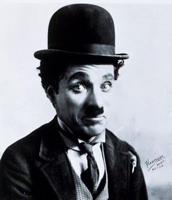
BOWLER (aka DERBY HAT)


ENGLISH DRIVING CAP


CHEF'S HAT


FEZ


COWBOY HAT


 TAM O'SHANTER


FEDORA


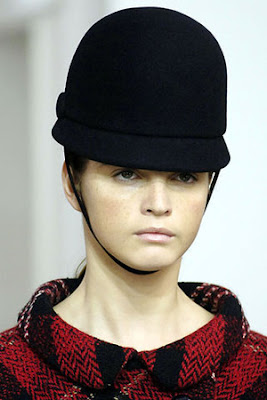
 JOCKEY HAT


HELMET


PHRYGIAN CAP


KUFI


PILLBOX HAT


NIGHT CAP


MORTARBOARD


PANAMA HAT


BRETON HAT


STOVEPIPE HAT


CAVALIER HAT


PITH HELMET


CLOCHE HAT


DEERSTALKER HAT


COOLIE HAT


PURITAN HAT


RASTAFARIAN HAT


SMOKING CAP


SOMBRERO

Monday, October 29, 2012

Things I Find Appalling: Outrageously Sexist Vintage Ads

"Times were different." This is a common excuse for society's past mistakes. Well, times might not be that great now, but in some very important ways they are a lot better.

Today marks the first in a mini-series of posts where I will gather a number of vintage print advertisements that display how different times were then than they are now. Today's vintage ads display the blatant sexist attitudes toward women that existed all over the realm of advertising in years past (sadly, some of them not all that long ago). Future posts in this series will include "Blatantly Racist Vintage Ads" and "It Seemed Like A Good Idea At The Time," among others.

I will warn you, some of these may make you mad, no matter whether you are a man or a woman. Others may make you laugh or simply shake your head. But all of them are real, as scary a thought as that is.

In some cases, where the type is small, I have transcribed the more egregious portions below the picture. In most cases, I have just added my own snarky remarks. If you should happen to miss the sarcasm in any of these and think I'm serious, that's not my fault.

I would normally say "Enjoy!" at this point, but I don't exactly think it would be appropriate this time. So I'll just say "Here they are..."


 "A cigar brings out the Caveman in you. There's a man-size feeling of
power in smoking a cigar. Because cigars give you a psychological 
lift along with flavor and satisfaction. yet you needn't inhale to 
enjoy  them...and no other pleasure so great costs so little. 
Try a few cigars  today and...Get that good cigar feeling!"


Because if it's not cooked the way HE likes it, then what's the point, right?


It's not as much what this one says as what it depicts. Very demeaning!


 Is that what's she's demonstrating? Really? I think I see
what image they're really trying to "project" here.


"It's nice to have a girl around the house. Though she was a tiger lady, 
our hero didn't have to fire a shot to floor her. After one look at his 
Mr. Leggs slacks, she was ready to have him walk all over her. That 
noble styling sure soothes the savage heart! If you'd like your own
doll-to-doll carpeting, hunt up a pair of those he-man Mr. Leggs slacks..."


 "Men are better than women! Indoors, women are useful -- even pleasant.
On a mountain they are something of a drag. So don't go hauling them
up a cliff to show off your Drummond climbing sweaters. No need to.
These pullovers look great anywhere. On the level!"


"Blow in her face and she'll follow you anywhere. Hit her with tangy
Tipalet Cherry. Or rich, grape-y Tipalet Burgundy. Or luscious Tipalet
Blueberry. It's Wild! Tipalet. It's new. Different. Delicious in taste and
aroma. A puff in her direction and she'll follow you anywhere..."


Imagine that!?!?


 "If your husband ever finds out you're not 'stove-testing' for 
fresher coffee...if he discovers you're still taking chances on
 getting flat, stale coffee...woe be unto you! For today there's 
a sure and certain way to test for freshness before you buy."


That's right, sugar. Wait on him hand and foot. Because he's a man!


This isn't an advertisement promoting aftershave.
It's an advertisement promoting rape! #smh


HUSBAND:  "Gosh, Honey, you seem to thrive on
 cooking, cleaning, and dusting -- and I'm all
tuckered out by closing time. What's the answer?"
WIFE: "Vitamins, darling! I always get my vitamins!"


Sitting around reading the newspaper and smoking
a manly cigar -- that's what husbands are for!


 "Sooner or later, your wife will drive home one of the best reasons for 
owning a Volkswagen. Women are soft and gentle, but they hit things.
If your wife hits something in a Volkswagen, it doesn't hurt you very
much...She can jab the hood. Graze the door. Or bump off the bumper.
It may make you furious, but it won't make you poor. So when your
wife goes window-shopping in a Volkswagen, don't worry. You can
conveniently replace anything she uses to stop the car. Even the brakes."


 Secretaries, look! It's a typewriter that makes you look busy while you
sit around and paint your nails. Because we men know that's what you
really do all day anyway. That, and gossip with the other ladies, of course.


 "A wife can blame herself if she loses love by getting 'middle-
age' skin!" This makes perfect sense. Her skin is a tad
wrinkly, her hubby goes out and cheats on her with a
less wrinkly woman. And this is all HER fault! Because
she didn't use Palmolive soap. For shame, for shame, wifey!


 He wears the cleanest shirts in town...his 'Missus' swears by Tide!"


Ladies and gentlemen, your government at its finest. Women 
everywhere used to wish they were men so they could join the
Navy. It's up to us guys to be the men that these women couldn't be!


 Well, if you have to ask...


"Does your husband yawn at the table? The things women have 
to put up with. Most husbands nowadays have stopped beating
their wives, but what can be more agonizing to a sensitive soul
than a man's boredom at meals? Yet, lady, there must be a reason.
If your cooking and not your conversation is monotonous, that's 
easily fixed. Start using soups more often..."


"Now she can cook breakfast again...when you prescribe Mornidine.
A new drug with specific effectiveness in nausea and vomiting of
pregnancy. Mornidine eliminates the ordeal of morning sickness."


And that's really all that matters, isn't it, old chap?


Yep, you've got to watch out for those "pick-ups," "good-time girls,"
and prostitutes. They may look clean, but they may be "loaded."
While you're at it, be wary of your own gal. She's probably cheating
on you behind your back with all your pals. Just like a woman!


"Married?-- No reason to neglect stockings. Husbands 
admire wives who keep their stockings perfect..."


"For simple driving." In other words, perfect for women drivers.


Like the song says, "Hoovers are a girl's best friend!"


Two things that every man wants, but no man gets...
because they don't exist. A "cool" Subaru...
and a spirited woman who yearns to be tamed.

Sunday, October 28, 2012

10 Worst Album Covers Of Albums Titled "Home"

Repeating yesterday's intro:

If you're any kind of a music buff at all, it's very likely that at some point you have listened to or even owned an album called Home. How do I know this? Because, throughout all the years of recorded music, countless artists in virtually every musical genre have released albums under this simple yet evocative title.

Yesterday I posted my picks for the 10 best album covers of Home-titled albums. Today I will post the 10 worst Home album covers.

Note: Each album's inclusion on this list is in no way a critique of the music itself. I've never heard of many of these albums, so I'm not judging the music by its cover. But I am judging the covers – that's the point.

Do you agree or disagree with my picks? Are there any lousily-designed Home albums that you know of that you would have included? Let me know...


1)  Six Cycle Mind:  This overused "boy band" pose has almost become a cliche of cover design over the years (see here). Okay, you four line up and stand casually -- you know, look cool. Maybe lean into one another a bit. You on the end, laugh like you just heard the funniest joke ever. Now you, the short one, you kneel down in a crouch at the other end there. Yeah, that's perfect. Now, smile! Cut. Print. It's brilliant!


2)  BoDeans:  Okay, here's the plan. We'll put the handsome guy with the long, flowing locks in front, smiling slyly like he knows the ladies are slobbering all over him. Then we'll put the weird-looking guy in back, looking over his shoulder at the handsome guy as if to say, "Gee, I wish I could be like him." We'll slap the name of the band over the bottom half of the cover, just in case our "vision" doesn't come through as clearly as we'd hoped, and we'll call the whole thing "Home." Makes perfect sense, right?


3)  Chris de Burgh:  This simply designed album cover says so much. A middle-aged guy who hasn't been relevant in a quarter of a century (since his 1986 hit "The Lady In Red") sitting on a lonely bench by a lonely shore strumming a lonesome tune on his lonesome guitar. Nothing says "washed-up" like dubbing the whole project "Home." This is a self-fulfilling prophecy: Chris, you're done here. It's time to move on. It's time to go home.


4)  Hothouse Flowers:  This was also a much-used album cover design during the late 1980s and early 1990s (see here). Have the members queue up in a staggered line. Tell them all to look introspective, or perhaps constipated. Snap the photo. Then go back and add touches of color to the edges so it looks like they're on a canvas. Make sure the band members stay in black-and-white, or perhaps purple. It's artsy, it's important, and people will want to buy it.


5)  Josh Rouse:  He's had a rough day. Dark circles under the eyes, hair tousled a little more than it was when he left the house this morning, and staring down an almost-empty glass of booze. He needs another one, and another, and another. But it's time to go home, and he doesn't want to. "Set 'em up, Joe. I'm not going anywhere. Home? This is my home now. And what a wonderful home it is..."


6)  Ryan Malcolm:  Hi, I'm Ryan. You're hot. Mind if I sit here? Don't worry, I won't bite. Much. You have pretty eyes, did you know that? I have pretty eyes, too. My mom told me. She says I have eyes that could stare right through a person. Pretty weird, huh? I mean, I'm not weird or anything. I'm normal. And I can prove it. The doctor said everything checked out fine. Anyway, I'm on medication, and I'm feeling much better now. I try to stay close to home, in case it happens again. The thing we don't talk about. Speaking of home, where do you live? Is it far from here? Can I come check it out? Don't worry, I don't bite. Often.


7)  Simply Red:  I am a rock star. I shine like the sun. I radiate awesomeness. I want the cover of my new album to capture the essence of who I am. So what if it's called "Home" -- that makes no difference. So what if there are actually other people in my band -- that's not my concern. This is about me. I am Simply Red. And don't you forget it!


8)  Spearhead:  Nothing says home like sitting at your kitchen table, holding your baby in your lap just inches above your semi-automatic weapon. He's looking toward the door. Who's he expecting? Bloods? Crips? Child Protective Services? All of the above? I guess you have to listen to the album to find out. I'll pass.


9)  Suzanne Palmer:  Ah, the funhouse mirror effect. A much-used classic that never goes out of style. Because one Suzanne Palmer is not enough. We must have two. We get not one but two chances to marvel at the ultra-stylish driving cap Suzanne's rocking. Not to mention that when you double your blonde hair weave, you double your fun! Sniff, sniff. What's that smell? Why, it smells like...home!


10)  Terry Hall:  Hi, I'm Terry. Welcome to my room. It's really nice. There's padding on all the walls, the floors, and even the ceilings -- though try as I may, I can't seem to reach the ceilings. I've been here for the past seven months. The staff here is really nice -- they see to my every need. They make sure I get my meds twice a day. The medicine helps a little. It quiets the voices a little bit. But they're never gone completely. Nor would I want them to be. The voices are the voices of my friends. You can see them, right? They're right here beside me. Don't be rude -- say hello to them. And while you're at it, please buy my album. It's crazy-good!

Saturday, October 27, 2012

10 Best Album Covers Of Albums Titled "Home"

If you're any kind of a music buff at all, it's very likely that at some point you have listened to or even owned an album called Home. How do I know this? Because, throughout all the years of recorded music, countless artists in virtually every musical genre have released albums under this simple yet evocative title.

So I decided to pick the 10 best album covers from this most voluminous collection of Home-titled albums. Tomorrow I will post the 10 worst Home album covers.

Please note: Their inclusion on either of these two lists is in no way a critique of the music itself. I've never heard of many of these albums (though I do own or have owned a few of them), so I can't rightly judge the music by its cover. But I am judging the covers – that's precisely the point.

Do you agree or disagree with my picks? Are there any Home albums that you know of that you would have included? Let me know...


1)  August Burns Red:  There's something remarkably beautiful in this lightly colored line drawing. It's just detailed enough to merit further scrutiny, yet not so much as to distract from its wonderful simplicity.


2)  Benjamin Biolay & Chiara Mastroianni:  If it doesn't jump out at you immediately, this cover is a highly stylized typography of the word "HOME." Sure, it's weird, and a bit abstract – but it's also quite artsy-fartsy (in a good way).


3)  Blessid Union Of Souls:  There's something about this photo and the surrounding layout that just screams: "Home! We're finally home again! After months and months on the road, it's so good to be home!" I love it! (Great album, too, by the way.)


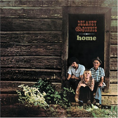
4)  Delaney & Bonnie:  This simple picture of the singers and some random elderly man on the porch of what I can only assume is a log cabin is remarkably effective at conveying the idea of "home." It's wonderful!


5)  Dixie Chicks:  Despite the slightly vampiric look of these three ladies (especially the one in the middle), I really like this album cover. The road behind them, a side road off to the right. Which one leads "home"? Why are they standing in the middle of the road? And why are they wearing evening gowns? This cover art has just enough unanswered questions to keep you guessing.


6)  Keller Williams:  No, it's not Keller Williams, the real estate company. It's Keller Williams, the singer/songwriter. I love the mirror effect of the bridge as reflected in the river here. The circles formed by the reflection reassure you that you can go home again, and that everything eventually comes back to where it started in the beginning. At least that's what I got out of it.


7)  Magenta:  The sadness in this lady's face, the evidence of rain on the glass, and the reflection of what appears to be an apartment building: these three elements combine to convey a sense of hopefulness in a hopeless situation. If only she can get back home, it will all be okay.


8)  Mr. Children:  I've never seen a truly three-dimensional family tree diagram...before now. What an ingenious idea! And to make it the album cover for a band called Mr. Children? Even better!


9)  Sevendust:  Maybe it's the writer in me that finds this fascinating – I don't know. But the image of a gnarled, scarred hand scribbling the word "Home" in pencil, in my opinion, makes for a great album cover.


10)  The Corrs:  I don't know what I love most about this cover: the startlingly realistic drawings of the band members, the subtle hints of color in the yellow-orange butterflies, or the fantastic font in which the band's name is written. Since I can't pick one, I'll pick all three. This one's a keeper!